THE LOGO
When I first heard that the program was called, IDEA, my first thought was lightbulbs. The classic, “oh, I have an idea!,” cartoon-lightbulb-popping-out-of-the-head, idea. However, that was not what the HR Department had in mind. The HR Department, who heads the recognition program, wanted the logo to look royal and prestigious. That was the word we kept coming to over and over, “prestigious.”
Knowing a thing or two about color theory, when hearing “prestigious” my mind went straight to purple. Purple, a color that often depicts royalty, seemed like the perfect choice. I then, with the help of my manager, went on to pull the idea (The pun, I know. Yikes.) for the logo. Taking the little lines that would come out of a lightbulb to express an idea, I attached them to the words “Universal Creative IDEA.” As always, I wanted to keep the brand consistency within Universal Creative, and I chose to do this by incorporating the brand’s fonts into the IDEA logo itself — Rock Sans. And thus, the Universal Creative’s IDEA Program logo was born.

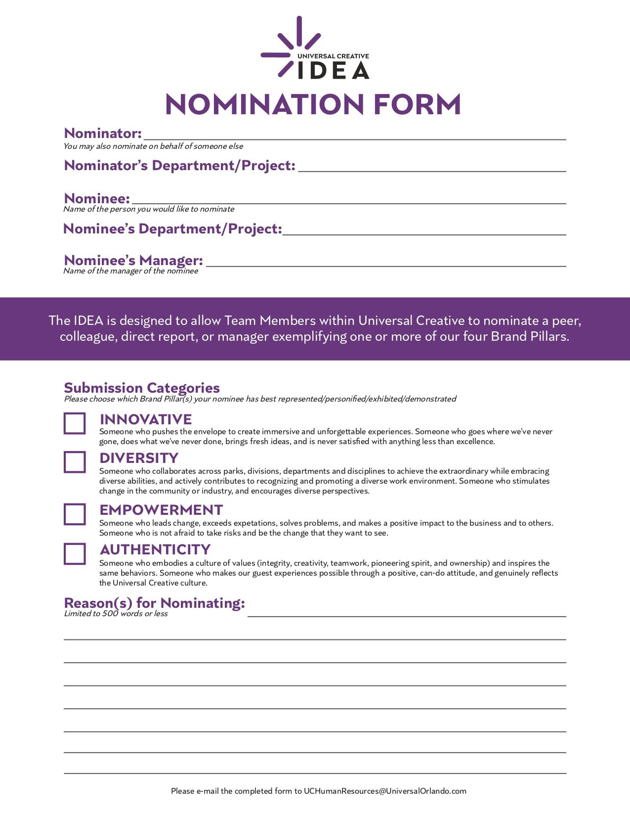
THE MATERIALS
It is always a fun challenge to really bring branding over into something as simple as a form or a certificate. With a certificate, you have some room to design, of course, but with something like a nomination form — that’s where it gets fun. It was an awesome opportunity (& sometimes a challenge) to bring IDEA’s branding to these two materials. Through the usage of colors, fonts, and logos, I was able to make this nomination form and award certificate truly a part of IDEA’s brand identity.